 Image 1 of 5

 Image 2 of 5

 Image 3 of 5

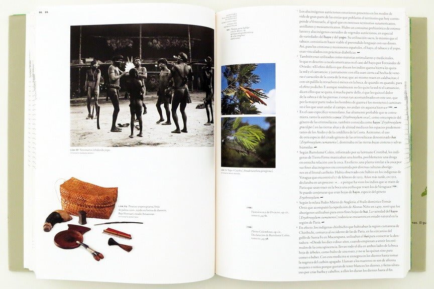 Image 4 of 5

 Image 5 of 5


Geohistoria de La Sensibilidad by Pedro Cunill Grau
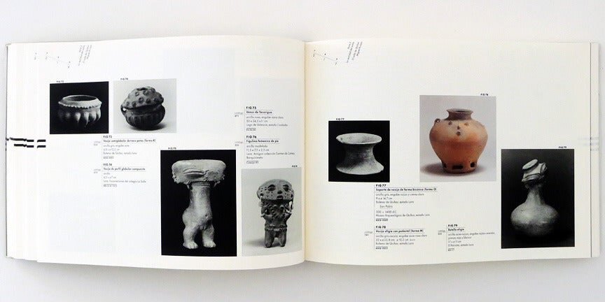
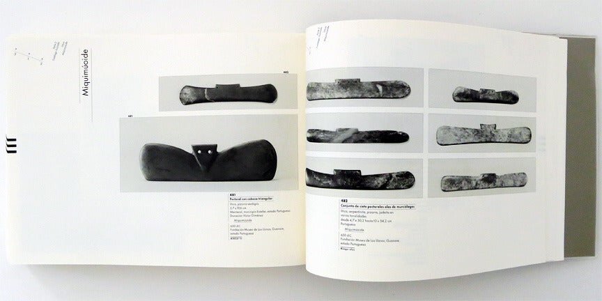
Item #: PEGR101 Published: Fundaci�_n Empresas Polar, Caracas Venezuela 2007 Language: Spanish Soft cover / Two Volumes B&W / Color ISBN#: 980-379-093-5 528 pages 8.5x11 inches Edition: First Edition Condition: Very Good. #First Edition #Latin American Books #Fine Art Books #Design #Encyclopedia Geohistoria de la Sensibilidad en Venezuela is the title of an impressive academic book. ́lvaro Sotillo and Gabriela Fontanillas, both excellent typographers from Caracas, have created a complex yet highly subtle typography. The various elements of text information are differentiated from one another as minimally as is possible and as clearly as is necessary, complex yet very subtle typography. Diverse information is characterized just so as to make it clearly distinguishable. The book-designer has refrained from using colored type, working instead merely with small contrasts in size, thickness and highlighting. The manner of binding (Japanese fold) opens up a wonderful possibility for navigation through the book. Its front edge is graced by a subtle thumb index. The layout is open and flexible. The designer has not become constrained by his own mesh, as is so often the case with such a large number of illustrations. This first edition of two volumes was the winner of the "Golden Letters", a maxim distention at "The most Beautiful Book of the World" from the foundation The Art of the Book of Leipzig in 2008. Esta Primera Edici�_n En Dos Vol̼menes Obtuvo El Premio "Letra De Oro" , M��xima Distinci�_n Del Concurso "Los Libros M��s Bellos Del Mundo" De La Fundaci�_n Arte Del Libro De Leipzig (2008).
Item #: PEGR101 Published: Fundaci�_n Empresas Polar, Caracas Venezuela 2007 Language: Spanish Soft cover / Two Volumes B&W / Color ISBN#: 980-379-093-5 528 pages 8.5x11 inches Edition: First Edition Condition: Very Good. #First Edition #Latin American Books #Fine Art Books #Design #Encyclopedia Geohistoria de la Sensibilidad en Venezuela is the title of an impressive academic book. ́lvaro Sotillo and Gabriela Fontanillas, both excellent typographers from Caracas, have created a complex yet highly subtle typography. The various elements of text information are differentiated from one another as minimally as is possible and as clearly as is necessary, complex yet very subtle typography. Diverse information is characterized just so as to make it clearly distinguishable. The book-designer has refrained from using colored type, working instead merely with small contrasts in size, thickness and highlighting. The manner of binding (Japanese fold) opens up a wonderful possibility for navigation through the book. Its front edge is graced by a subtle thumb index. The layout is open and flexible. The designer has not become constrained by his own mesh, as is so often the case with such a large number of illustrations. This first edition of two volumes was the winner of the "Golden Letters", a maxim distention at "The most Beautiful Book of the World" from the foundation The Art of the Book of Leipzig in 2008. Esta Primera Edici�_n En Dos Vol̼menes Obtuvo El Premio "Letra De Oro" , M��xima Distinci�_n Del Concurso "Los Libros M��s Bellos Del Mundo" De La Fundaci�_n Arte Del Libro De Leipzig (2008).

